Sepid
Category
Branding / Packaging / Web Design / E-Commerce / Campaign / Beauty
/
/
Duration
3 weeks
A premium skincare identity and launch system inspired by Persian cleansing rituals, translating mineral care, bathhouse architecture, and tactile product moments into a modern beauty brand.

A Skincare Brand Built Around Ritual, Not Trend
Sepid began as a response to a common problem in premium skincare: many brands look refined, but few have a clear reason to exist. The opportunity was to build a beauty concept with a sharper cultural and product foundation, using sefīdāb as the anchor for a modern ritual skincare system.
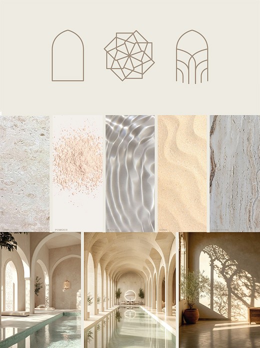
The strategy focused on clarity, materiality, and restraint. Rather than treating Persian influence as surface decoration, the brand uses ritual sequencing, architectural form, mineral texture, and bilingual details to create a world that feels specific, calm, and commercially believable.

A Complete System for Discovery, Purchase, and Use
The brand system was designed to work beyond packaging. Sepid needed to feel credible across the full customer journey, from first impression to product education, purchase, unboxing, retail discovery, and ongoing communication. The core idea, “Return to Ritual,” became the organizing thought across web, campaign, retail, email, and social.
The design language stays deliberately quiet: low-contrast labels, mineral paper textures, warm stone surfaces, editorial spacing, and architectural compositions. Product names and touchpoints follow a ritual sequence: prepare, purify, refine, nourish, and renew. This gives the brand a practical structure while preserving the slower, more tactile feeling of the category.

A Beauty Concept With Commercial Depth
The final system positions Sepid as more than a packaging concept. The identity extends into e-commerce, product storytelling, retail display, email, social, and out-of-home campaign assets, showing how the brand could behave across real business touchpoints.
The strongest part of the work is its discipline. The visual world is premium without relying on excess, and the cultural reference gives the brand a point of difference without overwhelming the customer. Sepid feels quiet, but complete: a skincare line built around ritual, clarity, and repeatable use.