Ready
Category
Healthcare Branding / Campaign / Digital / Social / Web
/
/
Duration
Multi-phase engagement
A unified brand and communications system that helped an on-demand healthcare company explain a new model of in-home care across patient, partner, field, and digital touchpoints.
Making a New Model of Care Easy to Understand
Ready connected patients with in-home medical support through trained Responders working alongside clinicians by telehealth. The model offered a practical alternative to unnecessary emergency room visits, but it required patients and healthcare partners to understand a service that did not fit neatly into traditional urgent care or virtual medicine.
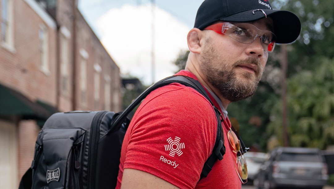
The creative approach focused on clarity, trust, and human connection. Direct language explained what Ready did, how each visit worked, and what patients could expect. A recognizable identity and documentary-style imagery helped position the service as professional, accessible, and grounded in real patient care.


One System for Patients, Partners, and Responders
The identity was built around a circular signal mark that suggested connection, reach, and care radiating outward. A high-contrast palette of red, black, white, and gray gave the brand strong recognition while avoiding the generic blues and softer visual conventions common in healthcare branding. Bold typography created clear information hierarchy across both campaign messaging and detailed operational materials.
The system was designed to function beyond advertising. Brand guidelines, patient forms, partner materials, uniforms, social content, field instructions, and the website all needed to feel connected while serving different audiences. Repeated graphic patterns, direct headlines, and disciplined layouts allowed each application to remain recognizably Ready without forcing every touchpoint into the same format.

A Brand Designed to Work at the Point of Care
The completed system gave Ready a practical framework for communicating with patients, healthcare partners, community organizations, and its own field teams. Every application supported a specific part of the service experience, from introducing the care model online to guiding Responders during an in-home visit.
The work succeeds because the identity does more than create recognition. It helps explain the service, organize complex information, and build continuity across the digital and physical moments surrounding patient care. The result is a healthcare brand that remains clear and consistent whether it appears on a website, a patient form, a uniform, or a social post.


