Coastline Oral & Facial Surgery
Category
Branding / Healthcare / Web Design / Print Collateral
/
/
Duration
2 weeks
A calm, patient-centered brand identity for an oral and facial surgery practice, designed to bring clinical confidence across signage, patient materials, digital touchpoints, and referral tools.
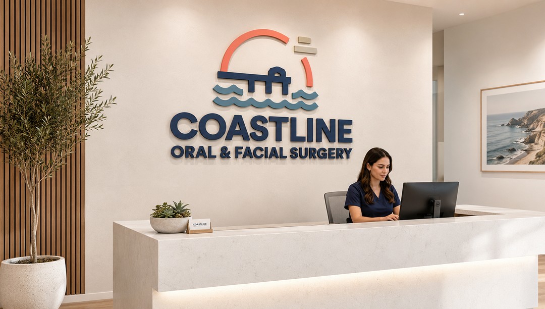
A more reassuring identity for surgical care.
Coastline Oral & Facial Surgery needed a brand system that could feel professional, clear, and approachable across a high-trust healthcare experience. Oral surgery can be intimidating, so the identity had to reduce friction without making the practice feel casual or generic.
The creative approach centered on calm clinical confidence. The logo combines a coastal bridge, waterline, and sun-like arc to create a distinctive mark that feels connected to the South Bay without relying on obvious beach imagery. From there, the system was extended into patient-facing, referral, and office touchpoints.
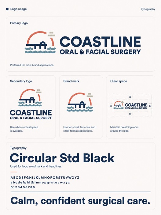

A brand system built around the patient journey.
The visual system uses strong navy typography, soft coastal blue, warm coral, and mineral neutrals to create a healthcare brand that feels precise without feeling cold. Circular Std Black gives the identity a sturdy, modern voice, while the supporting palette and wave elements add warmth and recognizability.
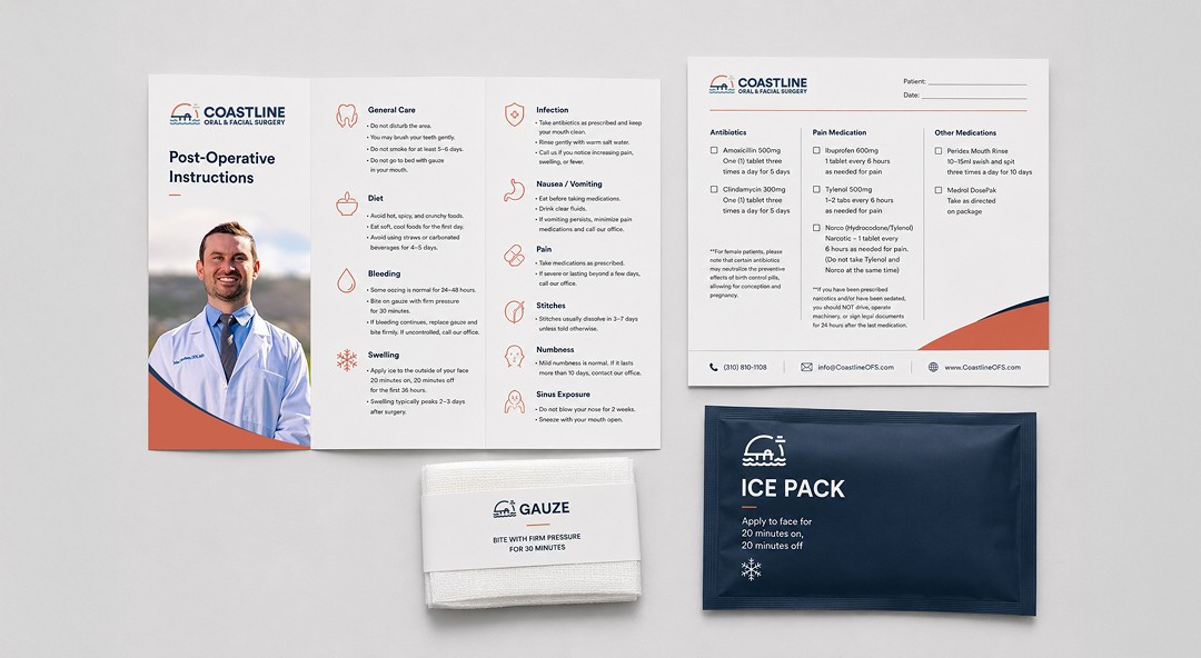
The work was designed to function across the full practice experience: first impressions, consultation, procedure education, post-operative care, referrals, and follow-up materials. Each application uses the same visual logic: clear hierarchy, generous space, restrained color, and useful information presented with care.

Clinical clarity with a warmer front door.
The final system gives Coastline Oral & Facial Surgery a more complete and credible brand presence. It works beyond the logo, creating a consistent language for the office, website, business cards, procedure folders, recovery materials, tote bag, and referral card.