Why Most Medical Practice Websites Are Losing Patients Before They Call
Healthcare
Web & Digital

A new patient finds your practice. Maybe through a Google search, a referral, or an insurance directory. They click through to your website.
What happens in the next 8 seconds determines whether they call — or move on to the next result.
Most medical practice websites lose that moment. Not because the care is bad. Not because the practice isn't qualified. But because the website quietly fails at its one job: converting interest into action.
The Stakes Are Higher Than Most Practices Realize
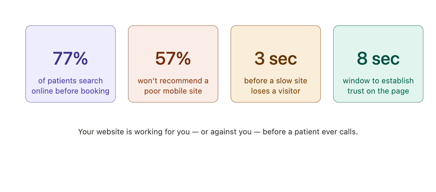
"Patients make trust decisions before they read a single word. Layout, load speed, and design quality signal whether a practice is worth their time."
1. The Site Looks Outdated
Patients make trust decisions fast. A website with a dated layout, generic stock photos, and hard-to-read text signals that the practice may not pay attention to details.
That's not a fair judgment. But it's the one being made — in seconds, subconsciously.
In healthcare especially, first impressions carry extra weight. If the website feels neglected, patients wonder what else might be.
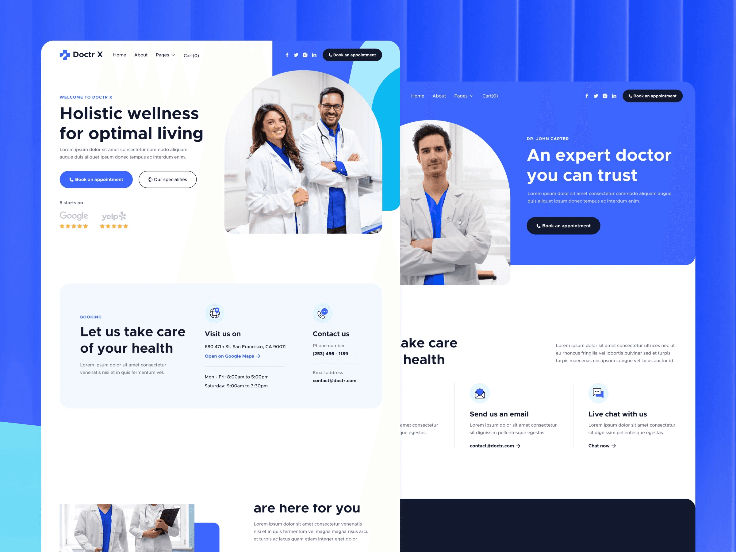
A modern, well-designed website isn't vanity. It's a trust signal. See how we approach medical practice web design.
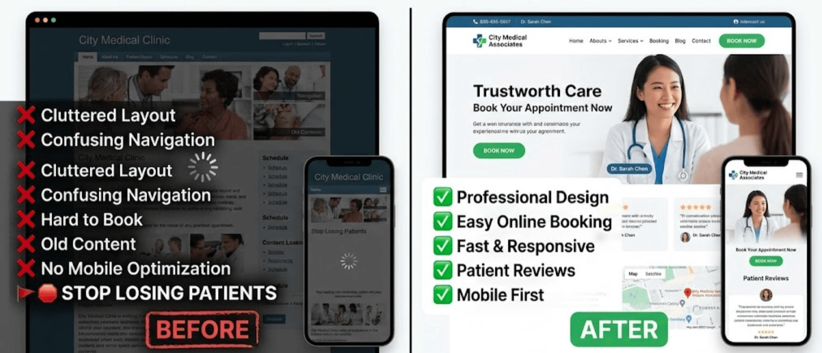
2. It's Not Built for Mobile
More than half of all web traffic is on mobile. If your site isn't optimized for a phone screen — small buttons, text that requires zooming, horizontal scrolling — patients leave.
Most won't report the problem. They'll just find another practice.
Mobile optimization isn't optional anymore. It's table stakes. Our digital work is built mobile-first by default.
"A website that doesn't work on mobile isn't just a technical problem. It's a patient experience problem."
3. There's No Clear Next Step
Patients land on your homepage ready to act. But there's no prominent call to action. The phone number is buried in the footer. The booking link is three clicks deep.
Friction kills conversions. Every extra step between a patient and booking is an opportunity to lose them.
Your website should make the next step obvious — and remove every barrier to taking it. That's where strategy and digital work together.
4. The Content Doesn't Answer the Right Questions
Here's what patients actually want to know when they land on your site:
What Patients Ask First | What Most Sites Lead With |
|---|---|
Do you accept my insurance? | Doctor credentials and awards |
Are you taking new patients? | Practice mission statement |
Where are you located? | Generic welcome copy |
How do I book an appointment? | Services list with no clear CTA |
Lead with what patients need. Let credentials and story follow. Strong content strategy closes this gap quickly.
5. It Takes Too Long to Load
Page speed is a conversion factor. A site that takes more than 3 seconds to load loses a significant percentage of visitors before they've seen anything.
Common culprits:
Oversized image files
Outdated or bloated plugins
Cheap shared hosting
No caching or compression
The fix is usually straightforward. It just requires someone paying attention — which is exactly what ongoing digital support covers.
6. There's No Social Proof Above the Fold
Patient reviews are among the most powerful trust signals a practice has. Most websites bury them — or leave them off entirely.
If you have strong Google reviews, they should appear early on your homepage. Not at the bottom where only the most motivated visitors scroll.
What a Better Website Does
What's Broken | What It Should Do |
|---|---|
Slow load time | Under 3 seconds on mobile and desktop |
No mobile optimization | Built mobile-first from the ground up |
Buried CTA | Book or call button visible immediately |
Wrong content order | Answers patient questions above the fold |
No social proof | Reviews visible early on the homepage |
Outdated design | Modern layout that signals trust instantly |
A well-built medical practice website doesn't need to be complicated. It needs to be clear, fast, and built around how patients actually make decisions. That's what we do at Studio Odyssey.
"The practices that invest in their digital presence aren't just better looking. They're filling their schedules while others wonder why the phone isn't ringing."
The Cost of Getting It Wrong
Every month your website underperforms is a month of lost patient inquiries. Not dramatically. Not all at once. Just quietly — a slow leak that's easy to ignore until you notice the gap.
If your site hasn't been updated in the last two years, it's worth a hard look.
We'll give you a clear, honest breakdown of what's working and what's costing you patients. No pitch. No obligation.
Also worth reading: How we approach branding for medical practices, and why automation is the missing piece most practices overlook.


Let's get to work
Your next patient is already looking.
Make sure they find you.
If you're ready to grow, now is the right moment to start.
Free 30-minute call.
We work with a limited number of practices at a time