What Patients Actually Look for on a Doctor's Website
Web & Digital

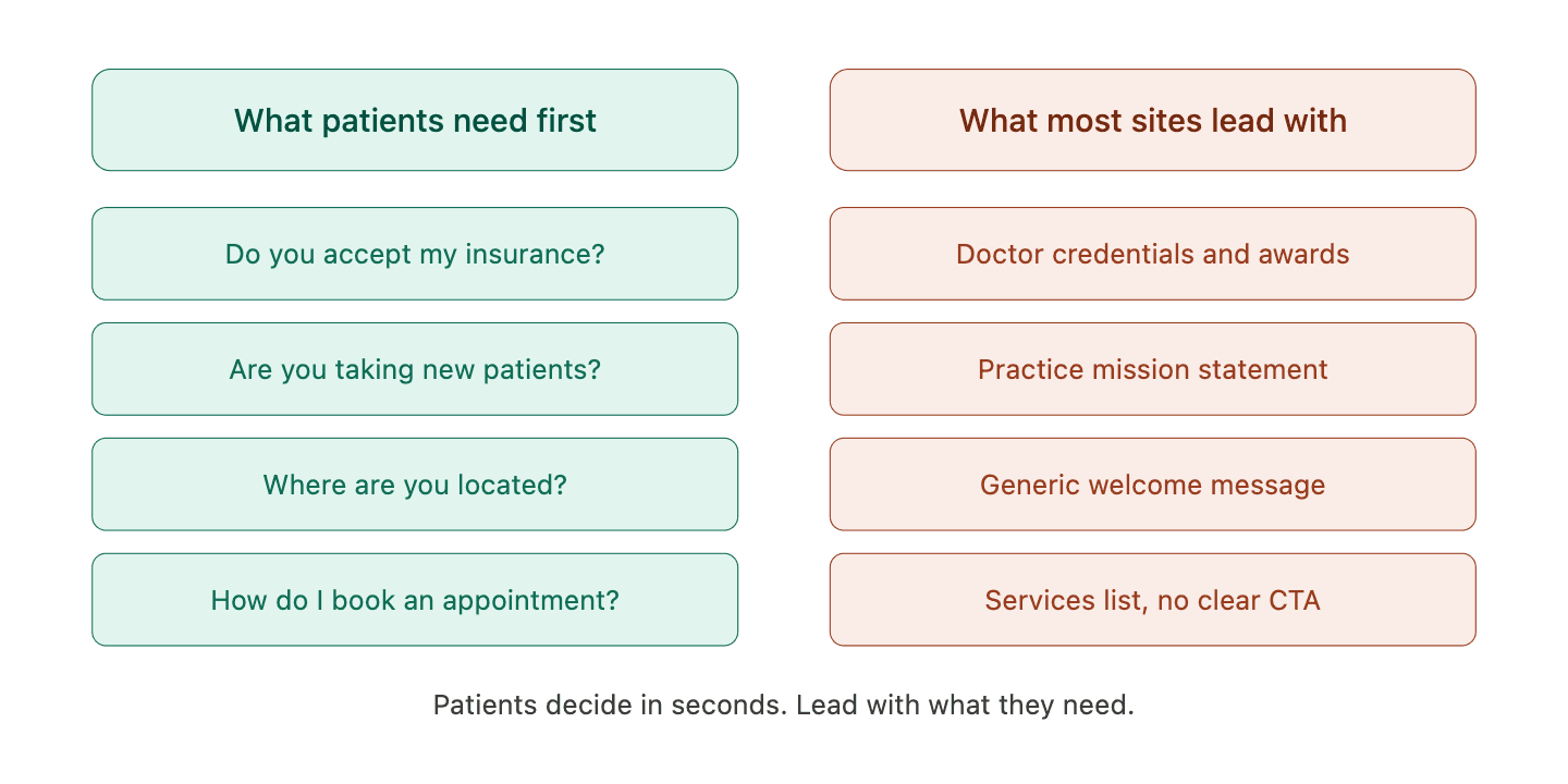
Most medical practice websites are built backwards.
They lead with credentials, mission statements, and award recognitions. All things the practice is proud of — and none of the things a new patient is actually looking for when they land on the page.
Understanding the gap between what practices publish and what patients need is the difference between a website that converts and one that just exists.
What Patients Want vs. What They Usually Find
"Patients aren't evaluating your résumé when they land on your homepage. They're trying to answer one question: is this the right place for me?"
1. Practical Information First
Before a patient cares about your philosophy of care, they need to know if your practice is even an option for them.
The questions they arrive with are simple and practical:
Do you take my insurance?
Are you accepting new patients?
Where are you located and is parking easy?
What are your hours?
If these answers aren't visible within the first scroll — or aren't on the homepage at all — a significant portion of visitors will leave before they ever learn anything else about your practice.
This is a content and strategy problem as much as a design problem. The information exists. It just isn't being surfaced in the right order.
2. A Clear Way to Book or Contact
The second thing patients look for is a frictionless path to take action.
Not a buried phone number. Not a contact form three pages deep. A visible, prominent call to action — ideally a booking link or a click-to-call button — that appears before they have to scroll.
Every extra step is a drop-off opportunity. Every moment of confusion is a reason to close the tab and try the next result.
A well-structured digital build puts the CTA in the right place by default.
"The practices filling their schedules aren't necessarily the best in their field. They're the easiest to say yes to."
3. Patient Reviews and Social Proof
New patients don't know your practice. They're making a trust decision with limited information — and reviews are one of the fastest ways to close that gap.
What patients look for:
Google review ratings visible on the site
Specific patient testimonials, not generic praise
Volume of reviews — a handful of reviews reads differently than hundreds
Most practices have strong reviews. Most don't feature them prominently on their website. That's a missed conversion opportunity on every page visit.
Strong branding work makes sure social proof is positioned where it actually influences decisions — not buried at the bottom of an about page.
📷 [Image placeholder: Homepage section showing Google review stars and 2-3 short patient testimonials]
Alt text: "Medical practice website homepage with visible Google review rating and patient testimonials"
4. A Professional, trustworthy Design
Patients can't evaluate your clinical skills from a website. What they can evaluate is how the practice presents itself.
A clean, modern design communicates:
Attention to detail
Operational competence
That the practice takes its patient experience seriously
An outdated or inconsistent design communicates the opposite — even if unintentionally.
This isn't about aesthetics for their own sake. It's about the signal your presentation sends before a patient ever walks through the door. See how Studio Odyssey approaches medical practice branding.
5. Information About the Doctor and Team
Once a patient has confirmed the basics — insurance, availability, location — they want to know who they're going to see.
What works here:
A real photo of the doctor, not a stock image
A short, human bio that doesn't read like a CV
Brief introductions to key staff members where relevant
Credentials matter. But a bio that reads like a résumé creates distance. Patients respond better to a voice that feels approachable and human.
6. Fast Load Time and Mobile Performance
Patients searching for a doctor are often doing it on their phone — between appointments, during a commute, or right after a referral.
If your site doesn't load quickly and work cleanly on mobile, you've already lost a significant portion of that traffic before they've seen anything.
Mobile performance and page speed aren't technical luxuries. They're basic requirements for a site that converts. Every digital build we do is optimized for both.
The Bigger Picture
What Patients Actually Need | Priority |
|---|---|
Insurance and availability info | Immediate — above the fold |
Clear booking or contact CTA | Immediate — above the fold |
Patient reviews and social proof | Early — first scroll |
Professional, trustworthy design | Throughout |
Doctor and team information | Mid-page |
Fast mobile performance | Always |
A website built around this order converts better than one built around what the practice wants to say. The good news is that the information practices want to share — credentials, philosophy, specialties — still has a place. It just comes after the patient's questions are answered first.
"The best medical practice websites don't feel like brochures. They feel like a helpful front desk — answering the right questions, making it easy to take the next step."
Not sure if your site is answering the right questions in the right order? We'll walk through it with you — no pitch, no obligation.
Also relevant: Why most medical practice websites are losing patients before they call and how automation keeps patients engaged after they leave your site.


Let's get to work
Your next patient is already looking.
Make sure they find you.
If you're ready to grow, now is the right moment to start.
Free 30-minute call.
We work with a limited number of practices at a time